Trong khoảng thời gian tới hoặc lâu hơn, tôi muốn bạn quên đi CSS. Hãy quên đi việc phát triển web. Hãy quên giao diện người dùng.
Và khi bạn quên những điều này, tôi muốn bạn cho phép tâm trí của bạn đi lang thang. Để lang thang ngược thời gian. Trở lại tuổi trẻ của bạn. Trở lại ngày đầu tiên đến trường.
Đó là một thời gian đơn giản hơn, khi tất cả những gì bạn phải lo lắng là vẽ hình và giữ sự không kiểm soát của bạn.

Hãy nhìn vào các chấm ở trên. Chú ý một số trong số chúng được kết lại với nhau, và một số trong số chúng lan ra? Những gì tôi muốn bạn làm là chia chúng thành năm nhóm cho tôi, mà bạn thấy phù hợp.
Tiếp tục. Sau khi kiểm tra xem không có ai đang xem, hãy vẽ một vòng tròn quanh mỗi năm nhóm bằng ngón tay giống trẻ của bạn.
Bạn có thể đã đưa ra một cái gì đó như dưới đây, phải không? (Và bất cứ điều gì bạn làm, đừng nói với tôi rằng bạn đã cuộn xuống mà không thực hiện bài tập. Tôi sẽ đối mặt với lòng bàn tay.)

Chắc chắn, hai dấu chấm bên phải có thể đã đi cả hai chiều. Nếu bạn nhóm chúng lại với nhau thì nó OK, tôi đoán vậy. Họ nói rằng, không có câu trả lời sai, nhưng tôi không bao giờ sai, vì vậy tôi không bao giờ bị kết thúc ở mức độ đặc biệt đó.
Trước khi tôi tiếp tục, bạn thử vẽ một cái gì đó như dưới đây?

Chắc là không. Đúng không?
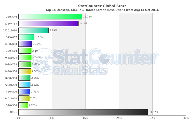
Nhưng điều đó về cơ bản là những gì bạn đã làm nếu bạn đặt điểm dừng của mình tại các vị trí khớp với chiều rộng chính xác của các thiết bị phổ biến (320px, 768px, 1024px).

Có những từ có ý nghĩa dưới đây đã bao giờ bạn nghe hoặc bạn đã nói?
“Is the medium breakpoint up to 768px, or including 768? I see… and that's iPad landscape, or is that ‘large'? Oh, large is 768px and up. I see. And small is 320px? What is this range from 0 to 319px? A breakpoint for ants?”
I could proceed to show you the correct breakpoints and leave it at that. But I find it very curious that the above method (“silly grouping”) is so widespread.
Why should that be?
I think the answer to this problem, like so many problems, comes down to misaligned terminology. After all, waterboarding at Guantanamo Bay sounds super rad if you don't know what either of those things are. (Oh I wish that was my joke.)
I think we mix up “boundaries” and “ranges” in our discussions and implementations of breakpoints.
Tell me, if you do breakpoints in Sass, do you have a variable called $large that is, say, 768px?
Is that the lower boundary of the range you refer to as large, or the upper boundary? If it's the lower, then you must have no $small because that should be 0, right?
And if it's the upper boundary then how would you define a breakpoint $large-and-up? That must be a media query with a min-width of $medium, right?
And if you are referring to just a boundary when you say large, then we're in for confusion later on because a media query is always a range.
This situation is a mess and we're wasting time thinking about it. So I have three suggestions:
- Get your breakpoints right
- Name your ranges sensibly
- Be declarative
Tip #1: Get your breakpoints right
So what are the right breakpoints?
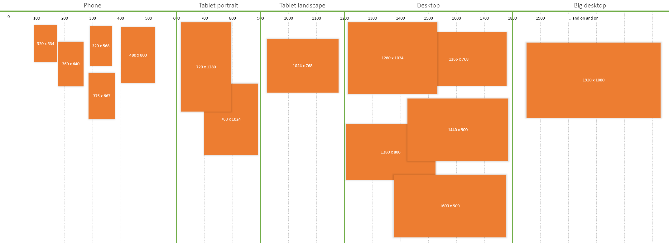
Your kindergarten self already drew the circles. I'll just turn them into rectangles for you.

600px, 900px, 1200px, and 1800px if you plan on giving the giant-monitor people something special. On a side note, if you're ordering a giant monitor online, make sure you specify it's for a computer. You don't want to get a giant lizard in the mail.
Those dots your channeled young self has been playing with actually represent the 14 most common screen sizes:
So we can make a pretty little picture that allows for the easy flow of words between the folks dressed up as business people, designers, developers, and testers.
Tip #2: Name your ranges sensibly
Sure, you could name your breakpoints papa-bear and baby-bear if you like. But if I'm going to sit down with a designer and discuss how the site should look on different devices, I want it to be over as quickly as possible. If naming a size portrait tablet facilitates that, then I'm sold. Heck, I'd even forgive you for calling it “iPad portrait.”
“But the landscape is changing!” you may shout. “Phones are getting bigger, tablets are getting smaller!”
But your website's CSS has a shelf life of about three years (unless it's Gmail). The iPad has been with us for twice that time, and it has yet to be dethroned. And we know that Apple no longer makes new products, they just remove things from existing ones (buttons, holes, etc).
So 1024 x 768 is here to stay, folks. Let's not bury our heads in the sand. (Fun fact: ostriches don't live in cities because there is no sand, and thus nowhere to hide from predators.)
Conclusion: communication is important. Don't purposefully detach yourself from helpful vocabulary.
Tip #3: Be declarative
I know, I know, that word “declarative” again. I'll put it another way: your CSS should define what it wants to happen, not how it should happen. The “how” belongs hidden away in some sort of mixin.
As discussed earlier, part of the confusion around breakpoints is that variables that define a boundary of a range are used as the name of the range. $large: 600px simply makes no sense if large is a range. It's the same as saying var coordinates = 4;.
So we can hide those details inside a mixin rather than expose them to be used in the code. Or we can do one better and not use variables at all.
At first I did the below snippet as a simplified example. But really I think it covers all the bases. To see it in action, check out this pen. I'm using Sass because I can't imagine building a site without it. The logic applies to CSS or Less just the same.
@mixin for-phone-only {
  @media (max-width: 599px) {
    @content;
  }
}
@mixin for-tablet-portrait-up {
  @media (min-width: 600px) {
    @content;
  }
}
@mixin for-tablet-landscape-up {
  @media (min-width: 900px) {
    @content;
  }
}
@mixin for-desktop-up {
  @media (min-width: 1200px) {
    @content;
  }
}
@mixin for-big-desktop-up {
  @media (min-width: 1800px) {
    @content;
  }
}

// usage
.my-box {
  padding: 10px;

  @include for-desktop-up {
    padding: 20px;
  }
}
Note that I'm forcing the developer to specify the -up or -only suffix.
Ambiguity breeds confusion.
An obvious criticism might be that this doesn't handle custom media queries. Well good news, everybody. If you want a custom media query, write a custom media query. (In practice, if I needed more complexity than the above I'd cut my losses and run into the loving embrace of Susy's toolkit.)
Another criticism might be that I've got eight mixins here. Surely a single mixin would be the sane thing to do, then just pass in the required size, like so:
@mixin for-size($size) {
  @if $size == phone-only {
    @media (max-width: 599px) {
      @content;
    }
  } @else if $size == tablet-portrait-up {
    @media (min-width: 600px) {
      @content;
    }
  } @else if $size == tablet-landscape-up {
    @media (min-width: 900px) {
      @content;
    }
  } @else if $size == desktop-up {
    @media (min-width: 1200px) {
      @content;
    }
  } @else if $size == big-desktop-up {
    @media (min-width: 1800px) {
      @content;
    }
  }
}

// usage
.my-box {
  padding: 10px;

  @include for-size(desktop-up) {
    padding: 20px;
  }
}
Sure, that works. But you won't get compile-time errors if you pass in an unsupported name. And to pass in a sass variable means exposing 8 variables just to pass to a switch in a mixin.
Not to mention the syntax @include for-desktop-up {...} is totes more pretty than @include for-size(desktop-up) {...}.
A criticism of both these code snippets might be that I'm typing out 900px twice, and also 899px. Surely I should just use variables and subtract 1 when needed.
If you want to do that, go bananas, but there are two reasons I wouldn't:
- These are not things that change frequently. These are also not numbers that are used anywhere else in the code base. No problems are caused by the fact that they aren't variables — unless you want to expose your Sass breakpoints to a script that injects a JS object with those variables into your page.
- The syntax is nasty when you want to turn numbers into strings with Sass. Below is the price you pay for believing that repeating a number twice is the worst of all evils:
@mixin for-size($range) {
  $phone-upper-boundary: 600px;
  $tablet-portrait-upper-boundary: 900px;
  $tablet-landscape-upper-boundary: 1200px;
  $desktop-upper-boundary: 1800px;

  @if $range == phone-only {
    @media (max-width: #{$phone-upper-boundary - 1}) {
      @content;
    }
  } @else if $range == tablet-portrait-up {
    @media (min-width: $phone-upper-boundary) {
      @content;
    }
  } @else if $range == tablet-landscape-up {
    @media (min-width: $tablet-portrait-upper-boundary) {
      @content;
    }
  } @else if $range == desktop-up {
    @media (min-width: $tablet-landscape-upper-boundary) {
      @content;
    }
  } @else if $range == big-desktop-up {
    @media (min-width: $desktop-upper-boundary) {
      @content;
    }
  }
}

// usage
.my-box {
  padding: 10px;

  @include for-size(desktop-up) {
    padding: 20px;
  }
}
Oh and since I've taken on a ranty tone over the last few paragraphs … I pity the fool who does something magical like store breakpoints in a Sass list and loop over them to output media queries, or something similarly ridiculous that future developers will struggle to decipher.
Complexity is where the bugs hide.
Finally, you may be thinking “shouldn't I be basing my breakpoints on content, not devices?”. Well I'm amazed you made it this far and the answer is yes … for sites with a single layout. Or if you have multiple layouts and are happy to have a different set of breakpoints for each layout. Oh and also if your site design doesn't change often, or you're happy to update your breakpoints when your designs update since you'll want to keep them based on the content, right?
For complex sites, life is much easier if you pick a handful of breakpoints to use across the site.
We're done! But this post has not been as furry as I would like, let me see if I can think of an excuse to include some…
Oh, I know!
Bonus tips for breakpoint development
- If you need to experience CSS breakpoints for screen sizes bigger than the monitor you're sitting at, use the
responsivemode in Chrome DevTools and type in whatever giant size you like. - The blue bar shows
max-widthmedia queries, the orange bar ismin-widthmedia queries, and the green bar shows media queries with both a min and a max. - Clicking a media query sets the screen to that width. If you click on a green media query more than once, it toggles between the max and min widths.
- Right click a media query in the media queries bar to go to the definition of that rule in the CSS.
Hey, thanks for reading! Comment with your tops ideas, I'd love the hear them. And click the little heart if you think I deserve it, or leave it hollow and empty, like my sense of self-worth will be if you don't.