Tổng quan về cách sử dụng flexible box layout
I spent the last days wrapping my head around flexbox, and how to use it correctly. Maybe you can relate to when I say, that it is not that easy to understand how it exactly works, or why some CSS rules don’t behave as expected under certain circumstances.
In this article, I just want to give a summary of what I think is important to know. So please keep in mind that this will not be an exhaustive description of all possible CSS rules and scenarios.
What’s flexbox?
Flexbox is a layout mode which is designed for laying out more complex applications and webpages. — w3.org
When using the flexbox layout model we distinguish between the two main elements: flex container and flex items.
The flex container is the parent element of your flex items. You set display: flex or display: inline-flex on this element to activate the flex layout mode.
Before outlining the details of a flex container or flex items, I want to talk about the terminology of the flex box layout model, which I found somehow confusing in the beginning. Here’s what I found about that in the flexbox specification:
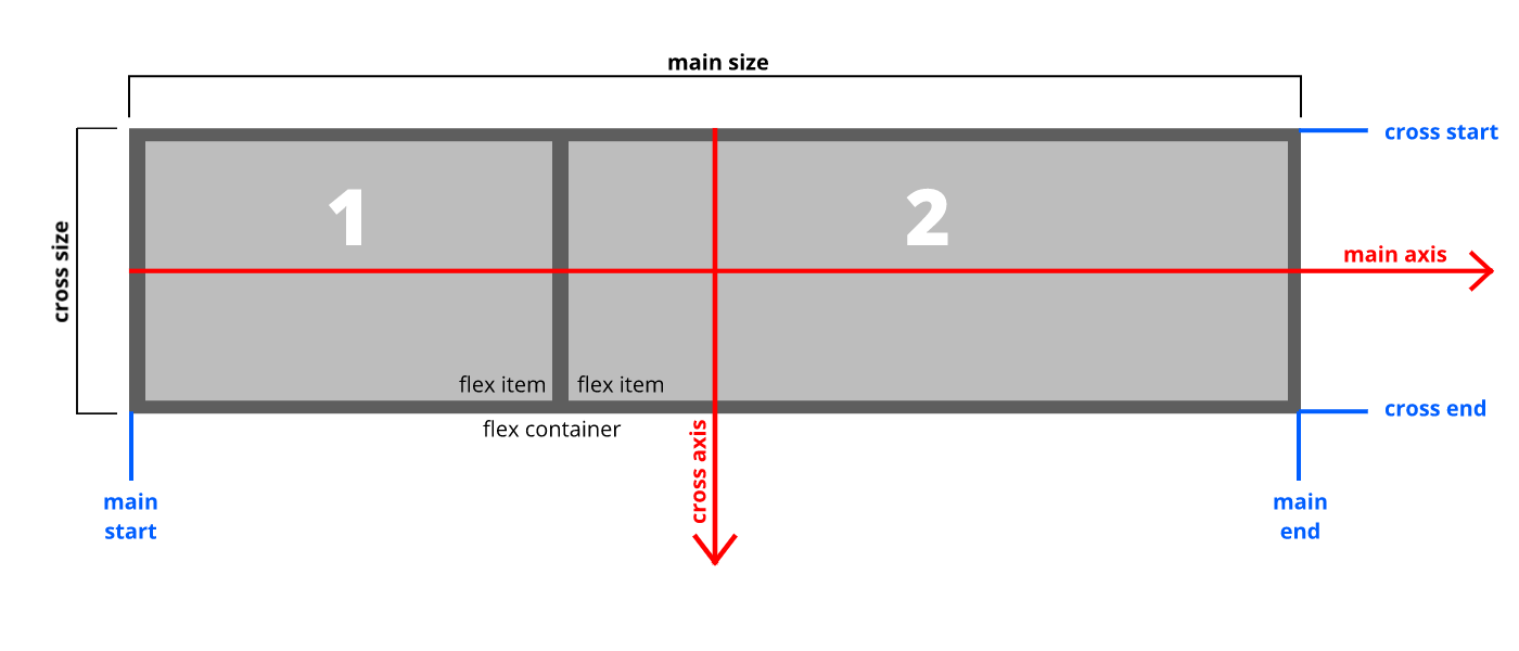 An illustration of the various directions, sizing and positioning terms as applied to a ‘row’ flex container.
First of all, in flexbox layout there is no horizontal or vertical. Instead, we orientate ourselves by a main axis and a cross axis.
Flex items are always laid out along the main-axis. In the image above, you can see, that the main-axis for a row flex container goes from the left end of the flex container (main start) to the right end (main end).
Basically, a column flex container is just a row flex container tilted by 90 degrees to the right.
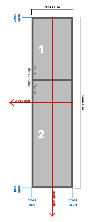 An illustration of the various directions, sizing and positioning terms as applied to a ‘column’ flex container.
For a column flex container things would look a bit different.
As you can see in the image on the left, as soon as you use flex-direction: column, the main-axis points towards the bottom of the screen, while the cross-axis goes from the right end to the left end of the flex container. So basically the whole picture is just tilted to the right, by 90 degrees.
This helped me a lot to orientate myself within a column flex container, since the CSS properties change their effective direction between row and column flex containers.
Now that’s all we need for now. In the following sections I’m going to describe the different CSS rules which are applicable for flex container and flex items.
The Flex Container CSS Rules
Let’s start with the CSS rules which are used on the flex container. I included some screenshots and put the respective CSS setting into the caption of the images.
flex-direction
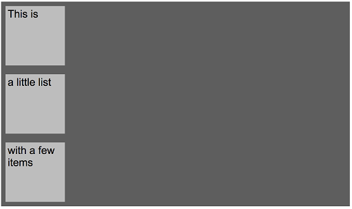
This rule determines if the flex-items are aligned in a row or in a column. Additionally, there is an option to align them in reverse order, heading from main-end to main-start.

flex-wrap
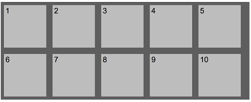
If you add more flex-items to a line, you will get to the point where there is not enough space for more. Since the flex-items shrink by default (see: flex-shrink the flex-items section) the items will get smaller the more items you add. By using flex-wrap you can control this behaviour if the items should stay in the same line (this is the default behaviour; flex-wrap: nowrap;) or wrap to the next line ( flex-wrap: wrap; or flex-wrap: wrap-reverse;)

flex-wrap: nowrap; as as applied to a ‘row’ flex-container
flex-flow
This is the first shorthand I will show you today. You can combine the CSS rules flex-direction and flex-wrap within one single CSS rule. The following list should speak for itself:
flex-flow: row wrap;flex-flow: row wrap-reverse;flex-flow: column wrap;flex-flow: column wrap-reverse;
justify-content
To position the flex-items alongside the main axis, you can use justify-content:

justify-content: flex-start; (default behaviour)


align-items
Now that you learned about justify-content to lay out items along the main axis, this is an easier one. align-items is used to align items along the cross-axis on the current line.
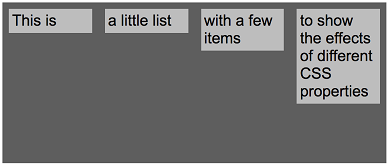
align-items: flex-start; (default behaviour)
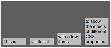
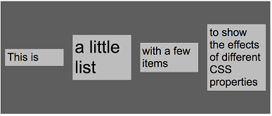
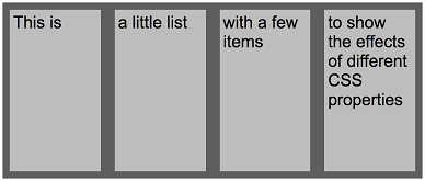
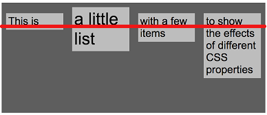
As you see, align-items also allows to stretch items to use the available space in the current line, as well as align-items: baseline;aligns items along the bottom line of their first line of text.
But what do you do if you don’t want to align the items within one line, but rather align the whole bunch of items within the available space of the flex-container? That’s what align-content is used for.
align-content
Let’s have a look how we can align the whole bunch of flex-items within our flex container:
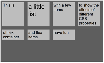
align-content: flex-start; (default behaviour)
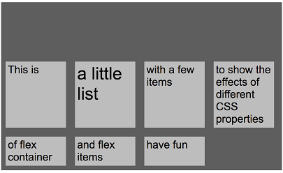
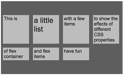
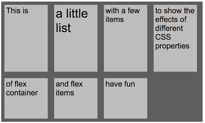
That was a rather short overview of what you are capable to do with flex-container CSS rules. In the next section I’m going to show you how you can adjust the behaviour of flex-items.
The Flex Item CSS Rules
In the last section you learned how to align all flex items at once — either within their line or within the available space of their flex container. Now it’s time to have a look at flex-grow ,flex-shrink ,flex-basis and the flex shorthand for those three rules.
flex-grow
Defines if items cang row to use the available space along the main-axis. The default value is 0, which means that flex-items don’t grow automatically. In the following pictures you can see which effect flex-grow has on flex items in a ‘row’ and in a ‘column’ container.

flex-grow: 0; (default behaviour) in a ‘row’ container

flex-grow: 1; in a ‘row’ container
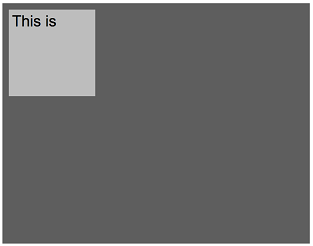
flex-grow: 0; (default behaviour) in a ‘column’ container
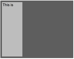
flex-grow: 1; in a ‘column’ container
With flex-grow it is also possible to let certain items grow more than others.
Example: We have three items. Two of them have flex-grow set to 1, while one of them got flex-grow set to 2.

What happened here? First of all, all flex-grow values of a line are added, which results in a total of 4 which represents 100% of our available space. Then each item is sized according to the relational size of its flex-grow setting to the sum of all flex-grow settings of said line. According to that calculation, the first two items get 25% of the available space and the third one gets 50%. Please note that I did not consider the padding and margin which is set in the image.
flex-shrink
By default, the shrink rule is set to 1. This means that as soon as the window is resized, the flex items will shrink if necessary. Possible values are 0 and 1.
Example: The flex item of the following picture has a width of 500px. With flex-shrink set to it’s default value 1, resizing the window means that the item will shrink to less than 500px width. When setting flex-shrink to 0, the item will not shrink and would exceed the window size and a scrollbar appears.

The item has a width of 500px. (Sidenote: flex-grow is switched off)
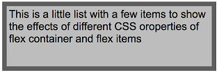
flex-shrink is turned on — resizing the window also resizes the item.
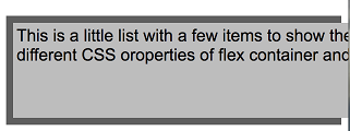
flex-shrink turned off. The item exceeds the window (scrollbars omitted in this picture)
flex-basis
The flex basis defines the initial main-size of a flex item. This setting will be evaluated before the available space is distributed to flex-grow, or the items are resized by flex-shrink.
The initial main size of the flex item before free space is distributed to the flex factors. — w3.org
flex-basis accepts either a length in px || em || rem or percentages, as well as auto.
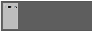
If flex-basis is set to auto, the width will be calculated based on content size. So the more you increase the content of a flex item, the bigger it gets.
As soon as you set a fixed size to flex-basis, the content of the item will adjust to fit into the item.
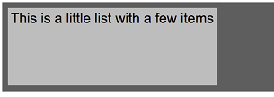
flex-basis: auto; with more content
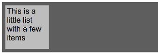
The flex shorthand
Because it is way more comfortable to set the above rules all at once, there is a shorthand to do so: The default setting for this is flex: 0 1 auto;
With the shorthand you define flex-grow with the first, flex-shrink with the second, and flex-basis with the third argument.
It is also possible to omit the last parameter: flex: 0 1 which defaults flex-basis to zero*.*
The following pictures show some examples how you can arrange flex-items using the flex shorthand.
flex: 0 1 auto (default behaviour) The item size is defined by its content.

flex: 0 1 auto; (default behaviour)
flex: 1 1 auto

flex: 0 0 auto This is the same as the example in the above section “flex-shrink”. Shrinking is turned off, which leads to the item overflowing the window size.

Relative size of flex-items To use the same “relative” sizing technique I described in the section “flex-grow”, you have to set flex-basis to zero. In the next picture, the first item has flex: 2 1 0; while the second item has flex: 1 1 0;

The first item got 2/3 of the available size while the second one got 1/3
Conclusion
Well that article grew a bit bigger than it was planned, but in the end, I hope you enjoyed the read. Maybe this article can serve as a handy guide to look up the different CSS rules if you want to brush up your knowledge, as this is something one might not memorize completely.
As I said in the beginning, this was never meant to be an exhaustive list of szenarios and rules which can apply, if you are interested in this in detail, I would suggest to read the articles I mentioned in the beginning of the article, as well as parts of the specification (if you don’t want to read the whole thing)
- Understanding Flexbox: Everything you need to know (Ohans Emmanuel)
- 11 things I learned reading the flexbox spec (David Gilbertson)
- CSS Flexible Box Layout Module Level 1
At first, I planned to also create this as a handy cheatsheet, but then I found a really good one by Chris Coyier which I want to share with you:
Thanks for reading this article!